Green paint and I have a complicated history together. I always like to paint at least one room in my home green because it’s so soothing and looks beautiful with blue, which is my absolute favorite color. Over the years I’ve tried various shades of green paint including deep hunter green, earthy sage green, lovely greenish blues, and light almost neutral greens. I’ve purchased more samples of green paint than any other color. It can be a very tricky color because the undertones strongly influence how the color looks on the wall. I have painted and then immediately repainted more green rooms than I care to admit!
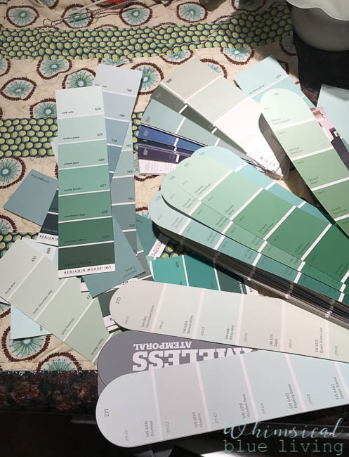
Friends, we know from personal experience that our castle is tricky when it comes to paint colors. The lighting varies so much, and the same paint color can look drastically different from one room to the next. When we first moved in I decided I wanted to paint the play room green and the living room blue. So I got out my trusty fan deck of paint chips and started searching for the perfect paint colors. I bought tons of little sample jars of paint to test out on the walls. Every time the green paint sample would dry on the playroom wall the color would change from green to light blue. It was strange! And I’d think, “Perfect! I want light blue paint in the living room!” I’d run over to the living room and paint a swatch of the green paint that had just dried blue on the wall, and this time when it dried on the living room wall it looked green. It was crazy! The same thing happened with my blue paint in the living room. All my blue paints looked green on the living room walls but the exact same paint color dried blue in the playroom. It was maddening! We finally ended up painting the living room a light gray that looks very blue in the light (“Aloof Gray” by Sherwin Williams) and the playroom a green that had more yellow undertones than blue (“Willow Tree” by Sherwin Williams). So, when my husband heard me say that I wanted to paint our daughter’s bedroom green, he knew that this process could potentially be headed for trouble. He immediately suggested that we use the same green color that was in her nursery in our house down south. Of course, I had already decided that I wanted a different shade of green paint, lighter than our last nursery and with a slightly more blue undertone. And so the search began…..
When I saw this picture on Susan’s blog I literally gasped! It was exactly the shade of green with a hint of blue that I wanted in my daughter’s room, and I loved how it looked paired with the pink bedding.
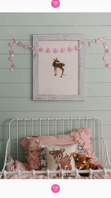
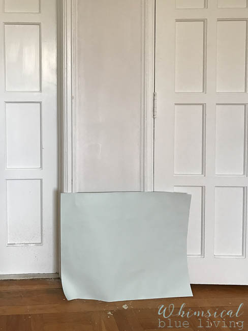
I commented on her blog asking her the name of the paint color she had used in her daughter’s room. She kindly responded, telling me that the dreamy color was “Lido Green” by Benjamin Moore. I don’t have a Benjamin Moore paint supplier near me, so I found a Sherwin Williams color that was very close called “Fleeting Green”. Our plaster guy had just finished repairing the walls and ceiling and I hadn’t had a chance to prime everything yet, so I couldn’t paint the sample paint directly on the wall. I painted two coats of the sample paint on poster board and leaned it against the wall in my daughter’s bedroom. After examining the color over several days I decided that it was the one and excitedly purchased two gallons!
On painting day I sent the kiddos to the babysitter, cranked up some swing music, and started rolling the paint on the walls. Right away I notice that the wet paint had a very blue look to it, but I told myself not to worry, because paint colors usually look different when they are wet. So I kept on going, sure that “Fleeting Green” was going to look perfect! But as the paint covered more of the walls and ceiling and started to dry, it looked even brighter blue. After a little while I started to get concerned. Was I just being overly paranoid, or was this room playing the same green-turns-blue-trick like the playroom? I snapped a quick cell phone picture and posted it to Facebook, asking people what they thought of the paint color.
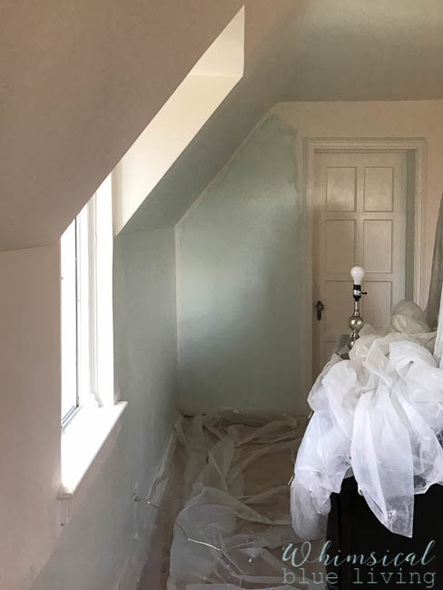
My Facebook caption for this picture read, “That moment when you’re painting a room you’ve been dreaming about for three years and the color is so neon baby blue that you can’t decide if you should keep going or quit… Does anyone else think it’s turning green around the top edge where it’s drying, or am I just viewing it through my hopes and dreams?”
Friends, this is why I love social media and blogging. So many of you commented on my Facebook post, encouraging me and making me smile in spite of my frustrating paint situation. One of my sweet friends from high school saw my post and sent me a message with pictures of her daughter’s old nursery, also painted “Fleeting Green”! Another childhood friend recommended her favorite Sherwin Williams color “Sea Salt”, just in case “Fleeting Green” didn’t work out. I was standing in my daughter’s room reading all the wonderful comments and suggestions, and even though I was disappointed about my paint color I was so encouraged by everyone’s support! You all are amazing!
I checked on the room repeatedly throughout the evening and the next day, hoping that maybe I would open the door and magically I would see an inspiring shade of green with just a slight hint of blue to it. No such luck. It looked bright blue with absolutely no hint of green, and there was no denying it.
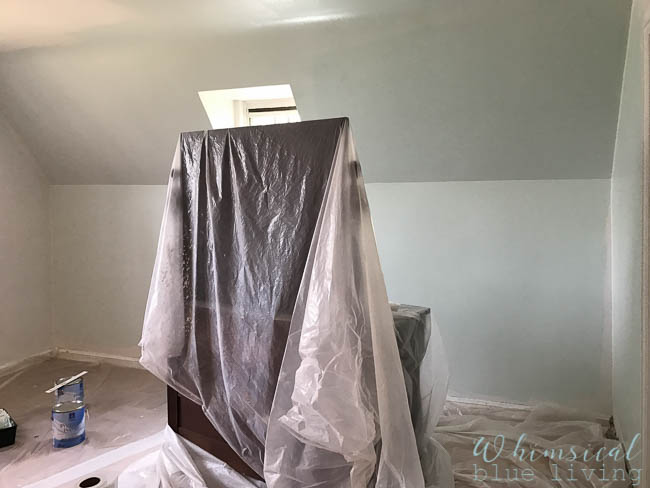
Here’s the tricky thing about pictures and paint. The paint looks green in pictures. I cannot get an accurate shot of the way it radiates a bright blue hue. Every time I take a picture and then look at the screen I think, “That’s what I want the paint to look like!” And then I look up and see the blue paint mocking me. It’s a very pretty color, just not what I want. Sigh…..
So I went back to Sherwin Williams to buy more samples, and they have a little machine that can find the closest match of their paint to a color of your choice. I had them match the Benjamin Moore “Lido Green” paint. Next, I had two options. They could either mix up a gallon for me that is a custom creation and is very close to the Benjamin Moore color. But I’d have to buy a whole gallon, not a small sample size. Or they can match the Benjamin Moore color to the most similar color that Sherwin Williams makes, which I can get in a sample size. I opted to find Sherwin William’s closest color so I could test out a sample size before paying for a whole gallon. I don’t even remember what the closest match was because it was too bright for the room when I looked at it on the color chip. Their second closest color suggestion was “Green Trance”, which I loved and almost bought a sample of, but then realized that it has an even stronger blue undertone than “Fleeting Green”. And “Sea Salt” looked incredibly gray under the florescent lights of the store. So ultimately, I decided to take a step back and wait to buy more samples. I can’t wait too long, because our daughter is currently sleeping in our bed and has an unfortunate habit of sleeping sideways and kicking me all night. I have to decide if I want to keep attempting to follow my green with a blue undertone dream or change it up a bit to a more neutral grayish green paint like “Sea Salt” (which is a pretty color that is incredibly popular on Pinterest). Decisions, decisions…
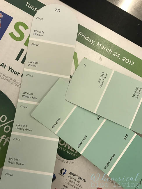
My inspiration color compared to similar Sherwin Williams colors.
Friends, have you ever had trouble picking a paint color? Please tell me I’m not the only one who has tested out samples and purchased two gallons of paint, only to change my mind once it dries on the wall. Or better yet, please tell my husband that I’m not the only person to do this! And if anyone is looking for a lovely blue paint that might turn green depending on the light, might I suggest trying “Fleeting Green”? I happen to know where you can buy a gallon and a half for a great deal!
For real time updates on our green paint dilemma follow Whimsical Blue Living on Facebook, Instagram, and Pinterest. And be sure to sign up for our newsletter to receive an email every Sunday morning with the posts from the week.
Have a beautiful day!
Sandy


Leave a Reply